CASE STUDY
How Apollo Rising Investment Group defines their brand
APOLLO RISING INVESTMENT GROUP
Apollo Rising sets their own market
Real estate investment group Apollo Rising supplied the image of a modern home concept. The challenge was to use this image as inspiration for the logomark, while emphasizing the distinction that it is an investment group, rather than a real estate brokerage.
SOLUTION
Fiduciary Corporate Identity
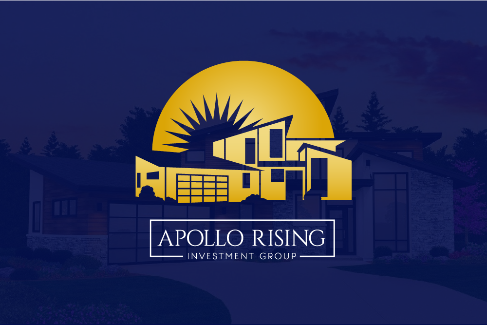
The owners wanted it to be clear that it is an investment group, not a real estate brokerage. Although using the image of a property, the logomark uses the golden hues of currency to convey professionalism in finance.
The typeface is a subtle serif that, when paired with the clean sans serif subhead, establishes approachable trust with refined professionalism.
Pairing the client supplied imagery with that of the Sun helps to strengthen the distinct association with the company’s namesake, the Sun God, Apollo. The position of the sun, “rising” behind the home, also supports this.
EXECUTION
Apollo Rising Investment Group
• Logo Design
• Typography
• Color Theory
• Vector Art from Image
Real estate investment group Apollo Rising supplied the image of a modern home concept. The challenge was to use this image as inspiration for the logomark, while emphasizing the distinction that it is an investment group, rather than a real estate brokerage.
Design Execution
The gold with a touch of black conveys a highly professional image, using the golden color as both a symbol for the rising sun as well as gold currency for investing. Refined, fiduciary, corporate.
Apollo Rising Investment Group Design by Victoria Zade
client case studies
See how we help companies and entrepreneurs around the world work smarter with consistent brand identities and on-brand consulting.
We’re pioneering the better-late-than-never movement of merging quality taste with high marketing impact and low environmental impact. We actively accelerate business performance with connected content. Essential to business enablement and embedded in every bit of written and visual content, our depth of consideration for your brand goes beyond data & metrics. It equips your team to focus on what you do best, or helps them create on-brand, high-performing business content faster. This teach-a-man-to-fish mentality quickly pays for itself. (Mother Nature approved!)


